Documentation and examples for
Light UI typography, including global
settings, headings, body text, and other
Text Utilities
Headings
All HTML headings, h1 through
h6, and p are available.
h1. heading
h2. heading
h3. heading
h4. heading
h5. heading
h6. heading
Pragraph
Lorem ipsum dolor sit amet consectetur adipisicing elit. Facilis
ut culpa quia pariatur est molestiae accusamus harum, quis
repellendus voluptatem fugiat tempora voluptate inventore
quibusdam rem distinctio molestias quo? Atque!
Text Utilities
Easily realign text to components with text alignment classes. For
start, end, and center alignment, responsive classes are available
Text align left
Text align center
Text align right
Large font text
Medium font text
Small font text
gray Text para
Headings
Heading in different sizes and different font weight
Main Heading LargeMain Heading X-LargeMain Heading sm
Font Family
Light UI uses Roboto, as its default
font, which is a free font available at Google Fonts.
Avatar
Avatars are user profile pictures, usually found in circular shapes.
Avatars can be used for 'container' objects — projects, spaces,
repositories, etcetera — to give them a recognisable visual
identity.
Round Avatar
Profile Avatars can be created using the class 'avatar', inside the
img tag.
Square Avatar
Adding a class 'square' to existing class, will generate a square
shaped avatar.
Badges
Badges are being used to display a notification count or status
information
Badge and Badge with icon
4
4
Badge with Button
44
Avatar with Badge
Alert
Alerts are used to attract user's attention for important
information without interrupting the user's flow.
Simple Alert
Simple Alerts can be created using alert class, followed by the
variant name.
Primary! A simple primary alert—check it out!
Secondary!
A simple alert—check it out!
Success!
A simple alert—check it out!
Danger! A simple alert—check it out!
Outline Alert
Outline alerts are created by using alert class, followed by
outline-variant
Primary! A simple primary alert—check it out!
Secondary!
A simple alert—check it out!
Success!
A simple alert—check it out!
Danger! A simple alert—check it out!
Button
Buttons are also called as call to action. We have range of buttons
and their states. You may use a tag or button element, you need to
add respective classes, and you are good to go.
Basic Button
Contained buttons are high-emphasis, distinguished by their use of
elevation and fill. They contain actions that are primary to your
app.
Button Large and Small
If you want to have different size for your button, you can add
btn-lg,
btn-small class for large and small
size respectively.
Button Large and Small
In need of a button, but not the hefty background colors they bring?
Button with Icon and Icon button
In need of a button with icons
Floating Button
Floating-action buttons can be customized by adding the font-awesome
icon of your choice. This button will be fixed to right-bottom
corner.
Images
Images can be responsive to fit the parent's width, and also can be
customised to be round shaped
Example of Responsive Image
You can add class responsive-img to
make your image fit the width of container. It's height will get
adjusted by keeping the aspect ratio same. If you want to change the
aspect ratio, you will have to crop the image.
Round Image
You can add class round-img to make
your image round shaped.
Inputs
Inputs are necessary for user interaction with the website. Inputs
are used to take information from the user, and then save the data
to the server, accordingly.
Label Inputs
Create beautifull and simple
input box
Form validation styles
In need of Error or success layout add error or success class on
input box
Card
Light UI cards provide a flexible and
extensible content container with multiple variants and options.
Cards with dismiss
simple card with heading and dismiss button on top with contant
Lorem ipsum dolor sit amet consectetur adipisicing elit.
Vel, tempora. Lorem ipsum dolor sit amet consectetur
adipisicing elit. Earum ullam iure dolor modi suscipit
voluptas perferendis repellat sequi est!
Card with Badge
in case need of badge on card you can add
card-badge class to div with contant
inside cardbox
new
Happy Coding
by Harshit Paliwal
Lorem ipsum dolor sit amet consectetur adipisicing elit. Vel,
tempora.
Card with Text Overlay
Coding World
by Harshit Paliwal
Lorem ipsum dolor sit amet consectetur adipisicing elit. Vel,
tempora.
Horizontal Card
Nike Pegasus
Size: 43
1
RS: 5000
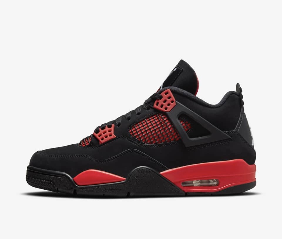
Card with button
new
Air Jordan 4
by Nike
RS 10,000
30% off
List
Lists can be used at so many places, navigation bar, stacked
notifications, article pages, etc.
Navigation bar is used to navigate through the web apps or websites.
This navigation component is responsive. It is a hamburger menu in
medium and small devices
||
Simple Navigation for desktop
Snackbars
Snackbars inform users of a process that an app has performed or
will perform. They appear temporarily, towards the bottom of the
screen. They shouldn’t interrupt the user experience, and they don’t
require user input to disappear.
Can't send photo. Retry
Can't send photo. Retry
This item already has the label "travel". You can add a new
label.
Ratings
Rating components can be used as read-only badge or in reviews
section. Can be used in reviews section as form too.
4.2 |196 Ratings
4.2
|
5
Read Only Ratings
3
|
5
Modal
Modals are positioned over everything else in the document and
remove scroll from the page. It gets closed only with close button
on modal pop-up.
Heading
Lorem ipsum dolor sit amet consectetur adipisicing elit.
Dolorem minima pariatur blanditiis accusamus nemo cum ut alias
non expedita voluptatem.
Simplified Grid
Use grid when you want sections in view. Check below some examples
of side by side cards.